top of page
Table of Contents
Disclaimer
Introduction
Summary of the Brief
Logo Design
Client's First Drafts
Some of the Final UI's
UI Assets
Extras
Disclaimer
This project is under an NDA, which means I am restricted from sharing certain details publicly, such as detailed UI screens, some of the specific features and they were designed and coded.
Introduction
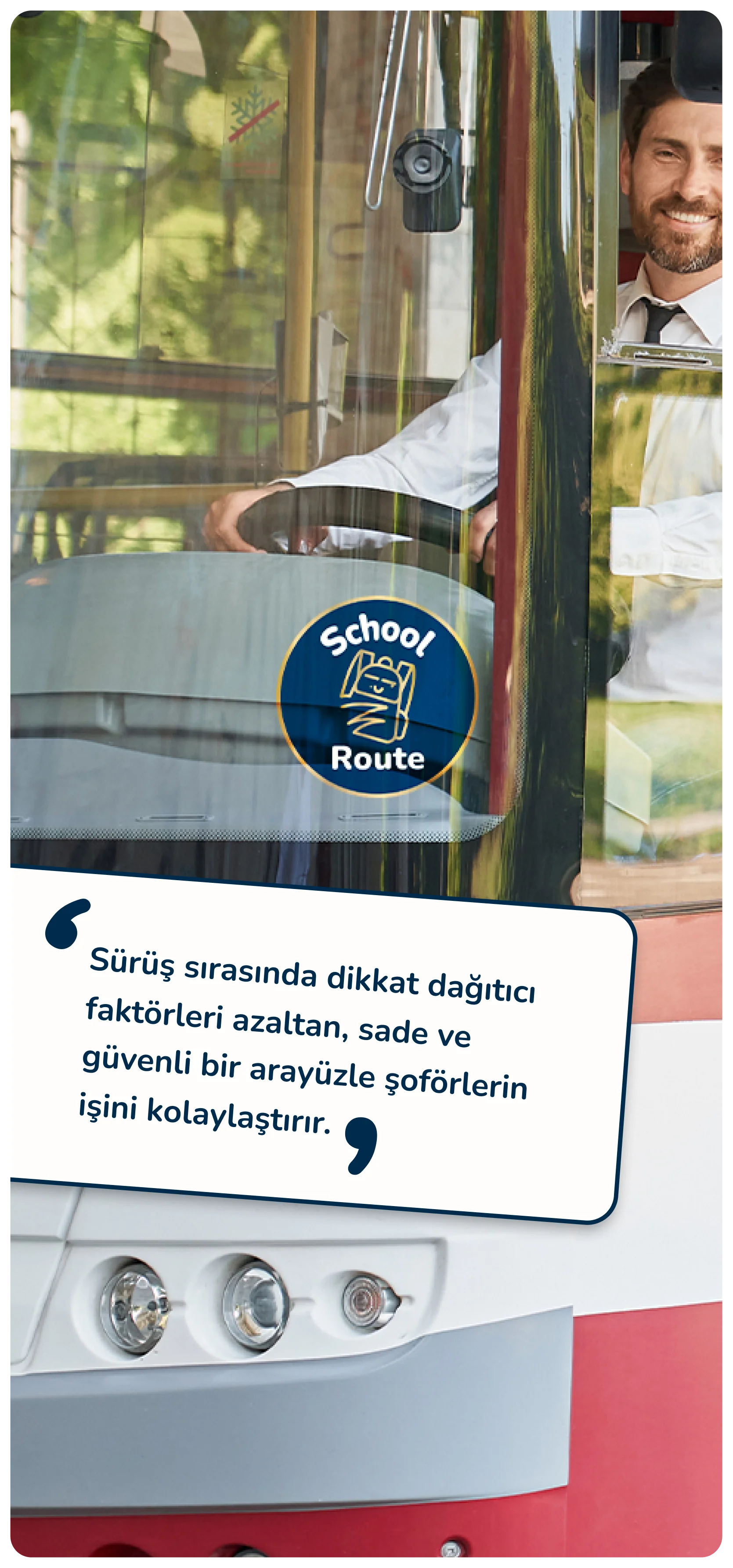
School Route is a shuttle tracking and management system. It streamlines the school bus system for schools, drivers, and parents. It allows organizations to monitor their vehicles in real-time. It makes drivers’ lives easier with a simple interface and allows parents to track their children’s location during commutes between home and school.
Date: 2024-2025
Role: Product Design
Services: UI/UX Design, Brand Design, Graphic Design
Scope: Mobile & Desktop
Summary of the Brief
"We need a system to monitor our vehicles' locations in real time."
"Parents should be able to track the locations of both their children and the school bus."
"From the drivers' perspective, the system should allow them to view passenger pickup points and mark students as 'present' or 'absent'."
"The ability to bulk import data for vehicles, locations, parents, and students is essential for organizations to manage the data."
Logo Design
The illustration of the school bag demonstrates the product's function and emphasizes the student's movement. The badge-style design is inspired by the stickers that students stick on their notebooks
and books.
Illustration
The very first idea was creating a playful mascot as a brand representative. After discussing it with the client, we decided to go with a simpler approach while keeping the mascot idea on the table. This was how the school bag illustration came to life.
Logo Offer
After the school bag illustration, we continued with the 'badge' idea, which reminds us of the stickers we stick on the covers of our books and notebooks. Also, the bag illustration was placed at a 15-degree angle to show movement. The primary logo was designed in blue, aiming to reflect the organizational characteristics of schools. The secondary logo was designed in orange with the intention of creating a more energetic and friendly approach.
Client's Request
Even though the client approved the illustration idea and the badge-style approach, the blue and orange colors were rejected. The client asked for a specific dark blue as a fill color and a golden gradient as a stroke color. As a designer, I did not support this color combination but eventually the client happily accepted the versions below.


First Drafts From the Client
Before working with us, the client had already designed some UI screens with a front-end developer to understand what they actually needed and what features would be useful for the product and the users. These are the very early UI screens the client created.
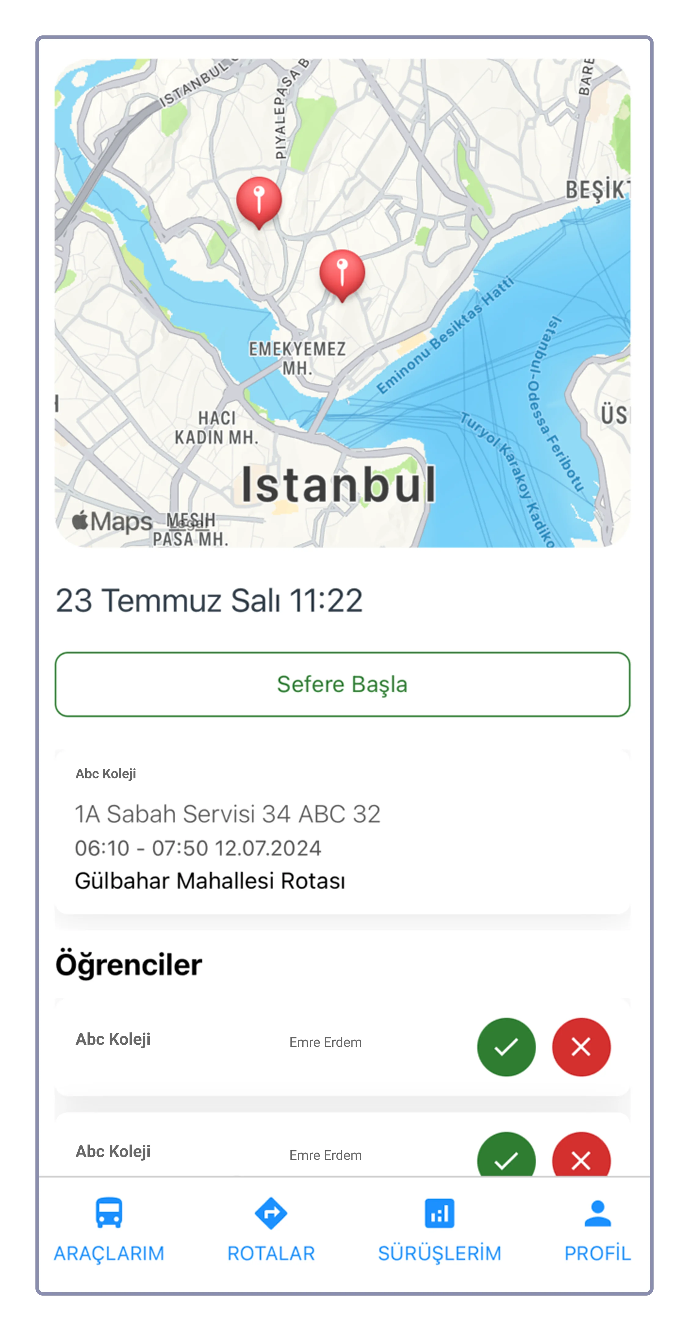
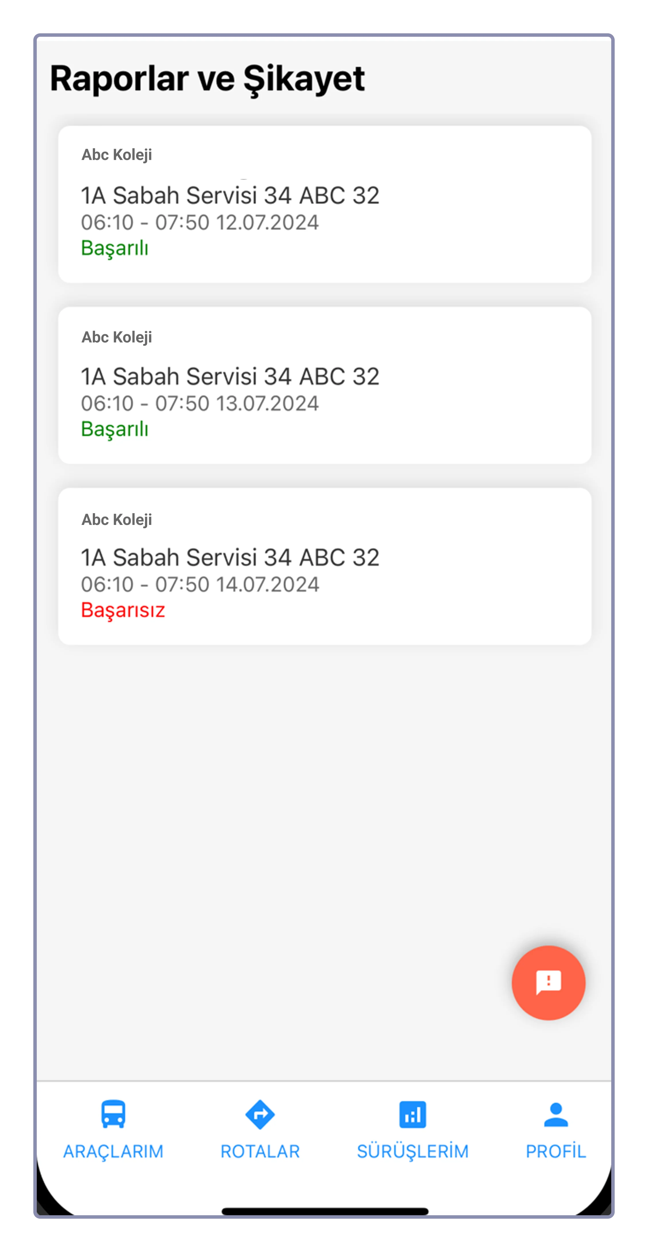
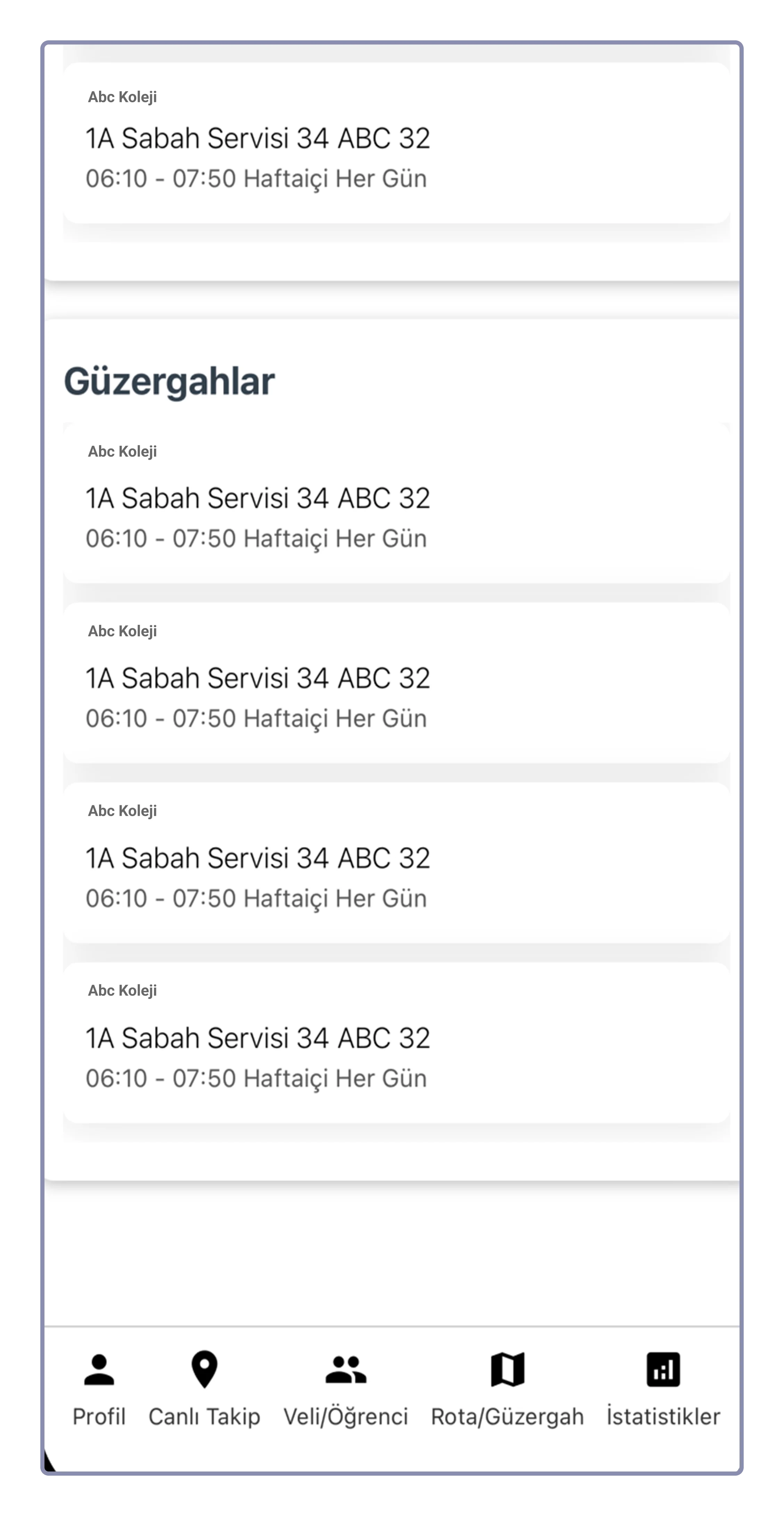
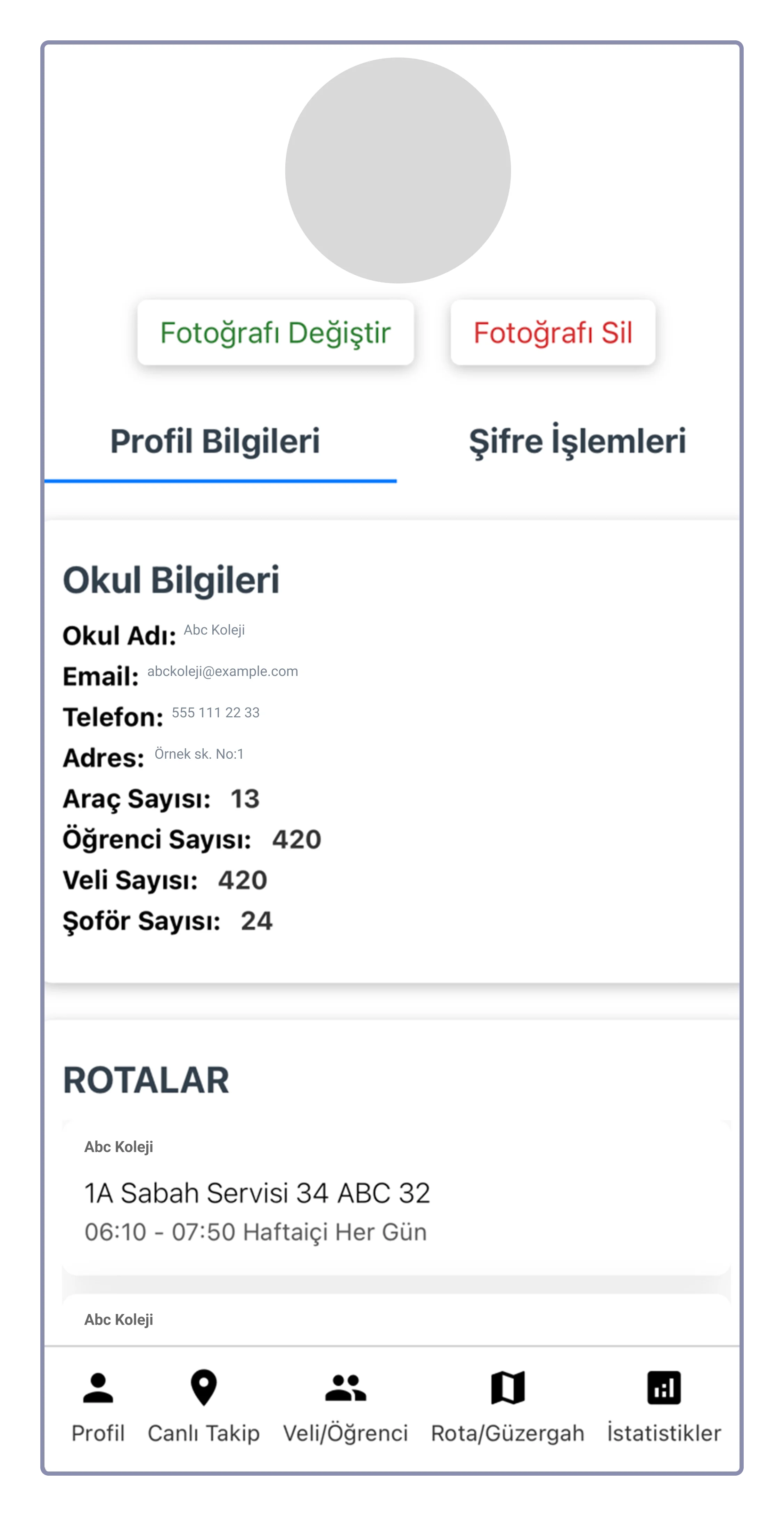
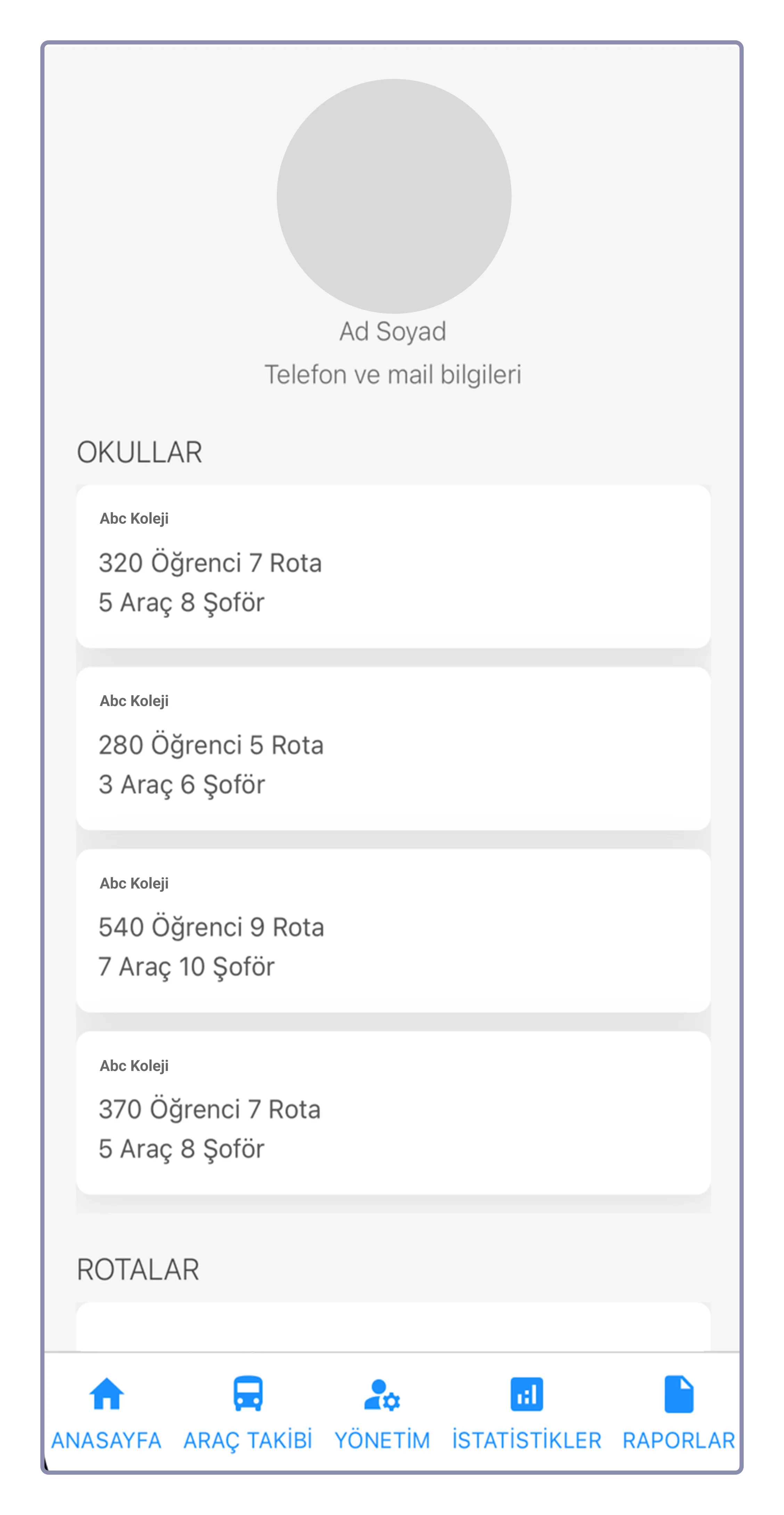
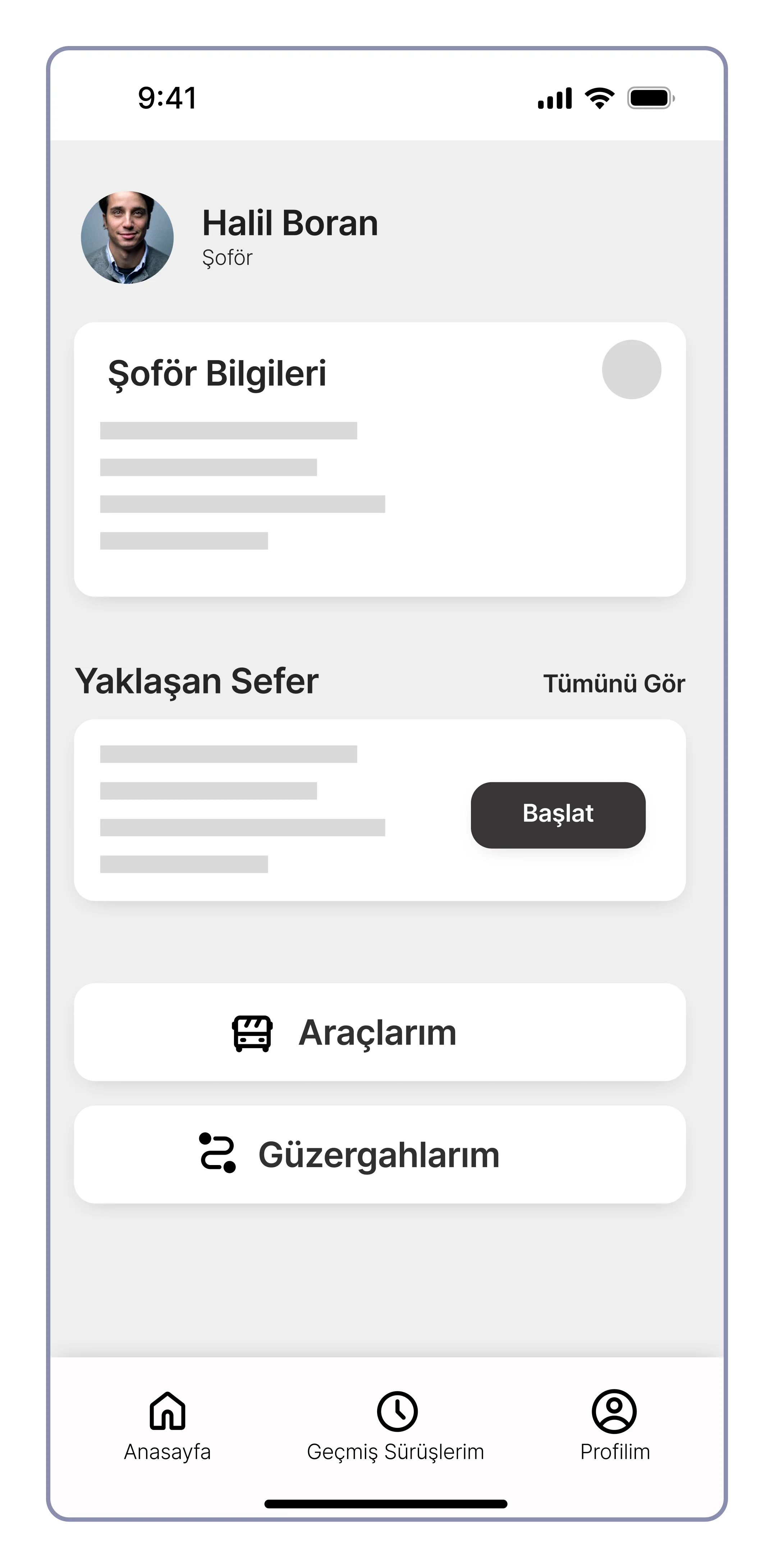
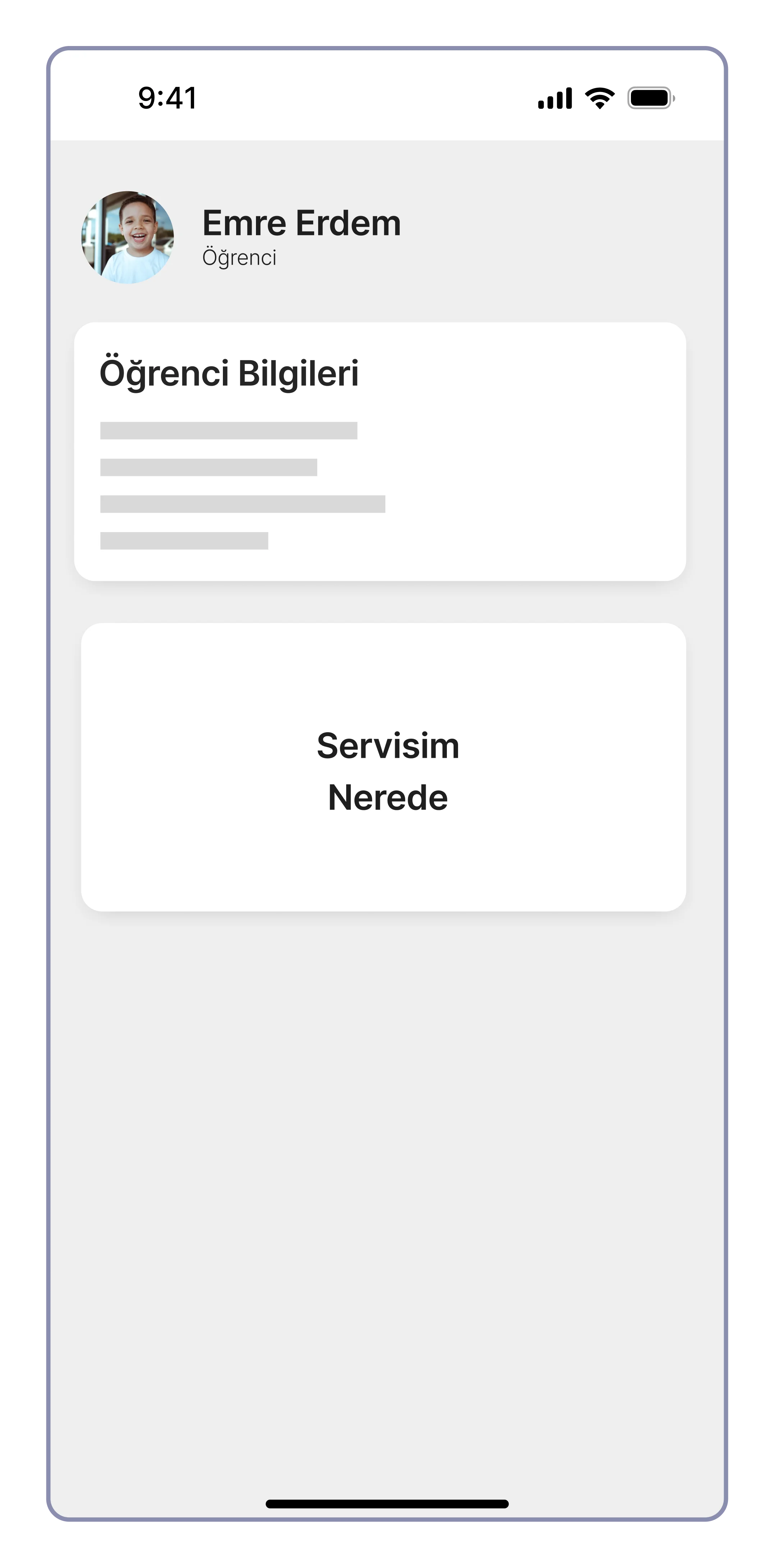
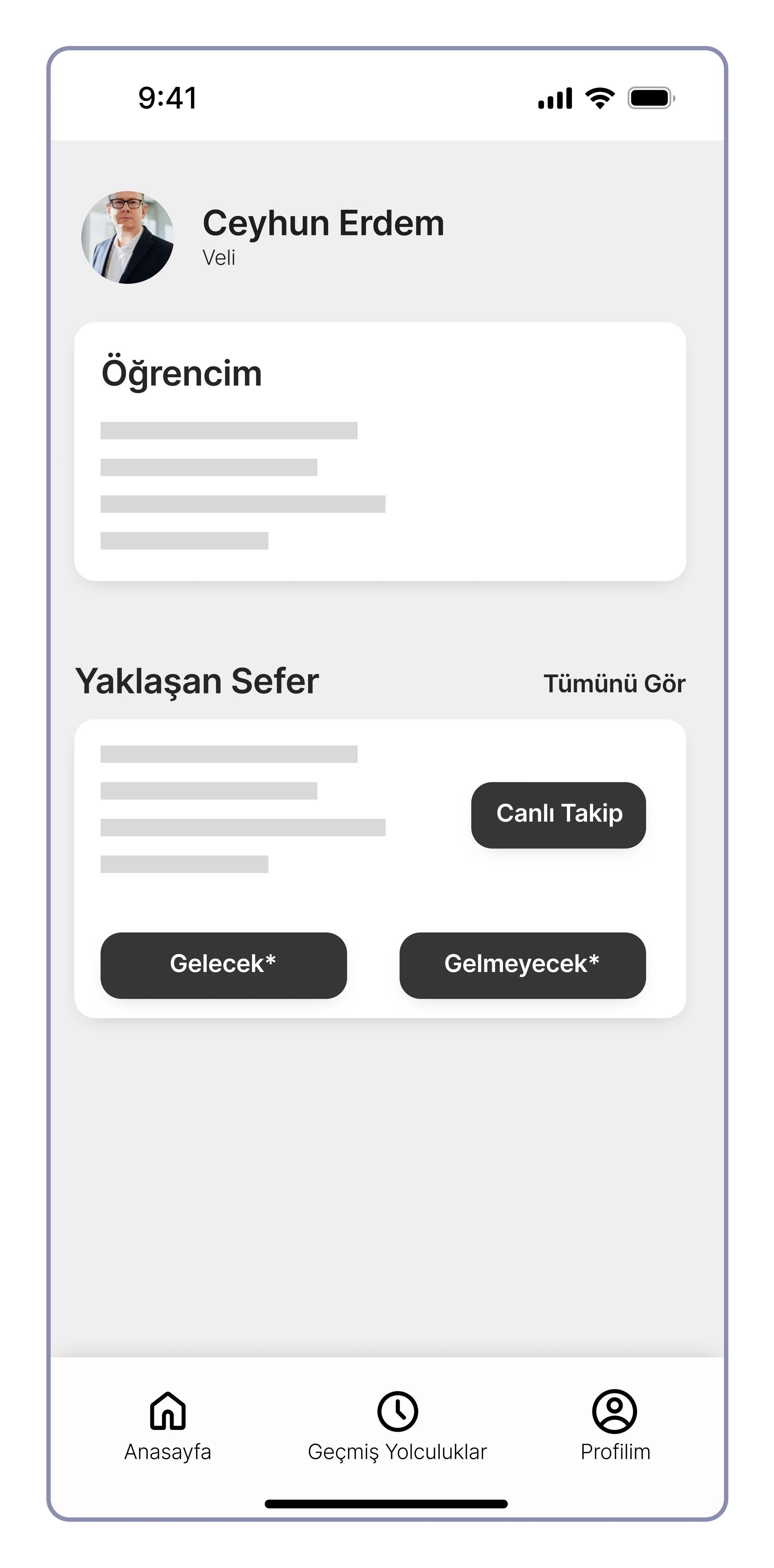
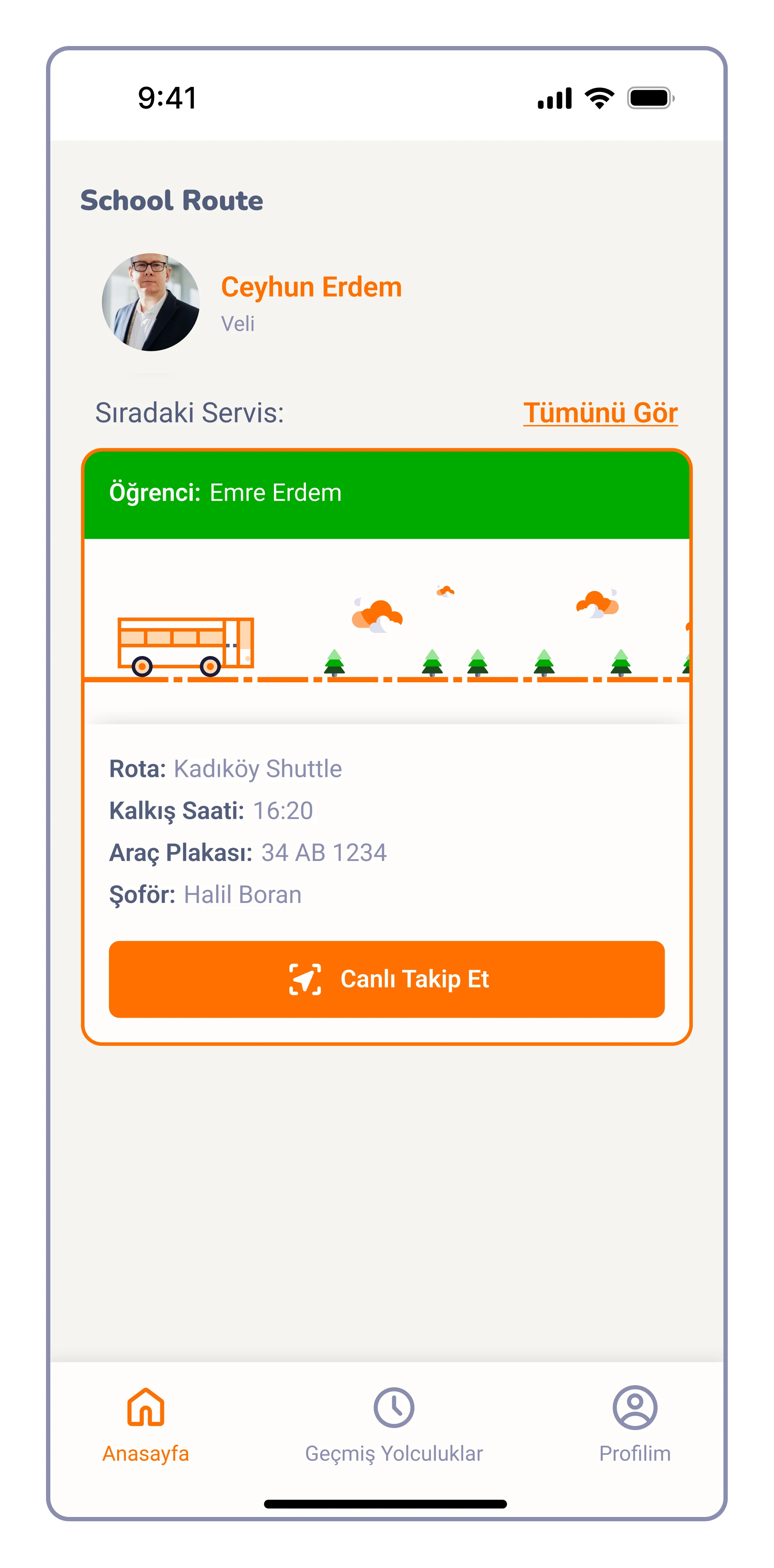
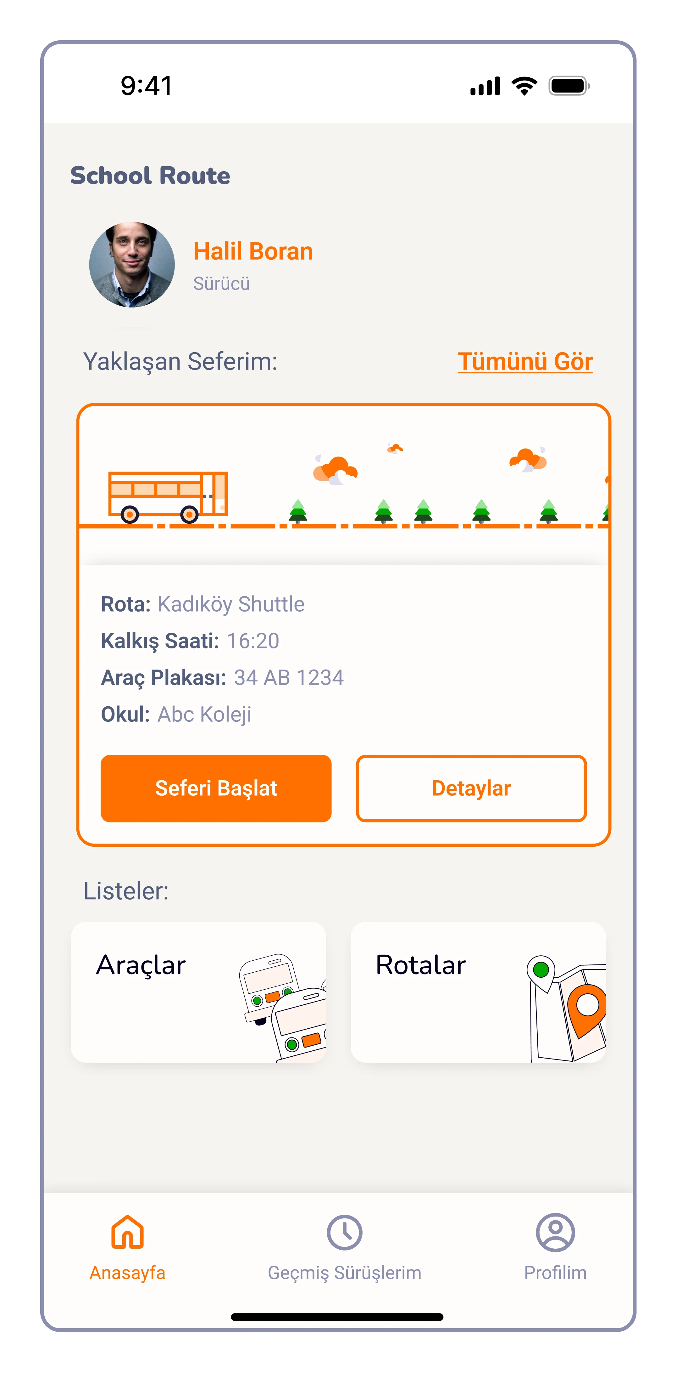
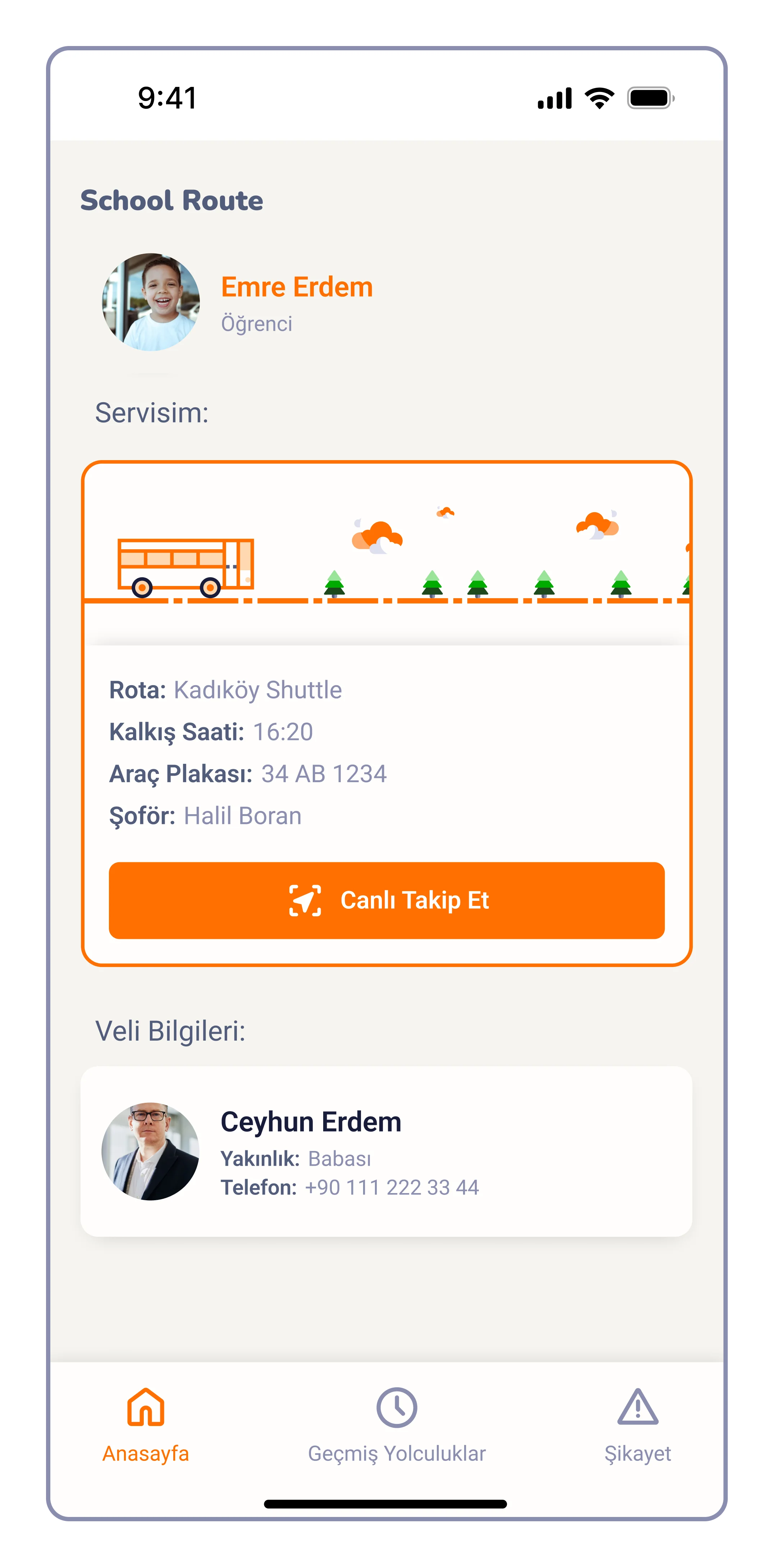
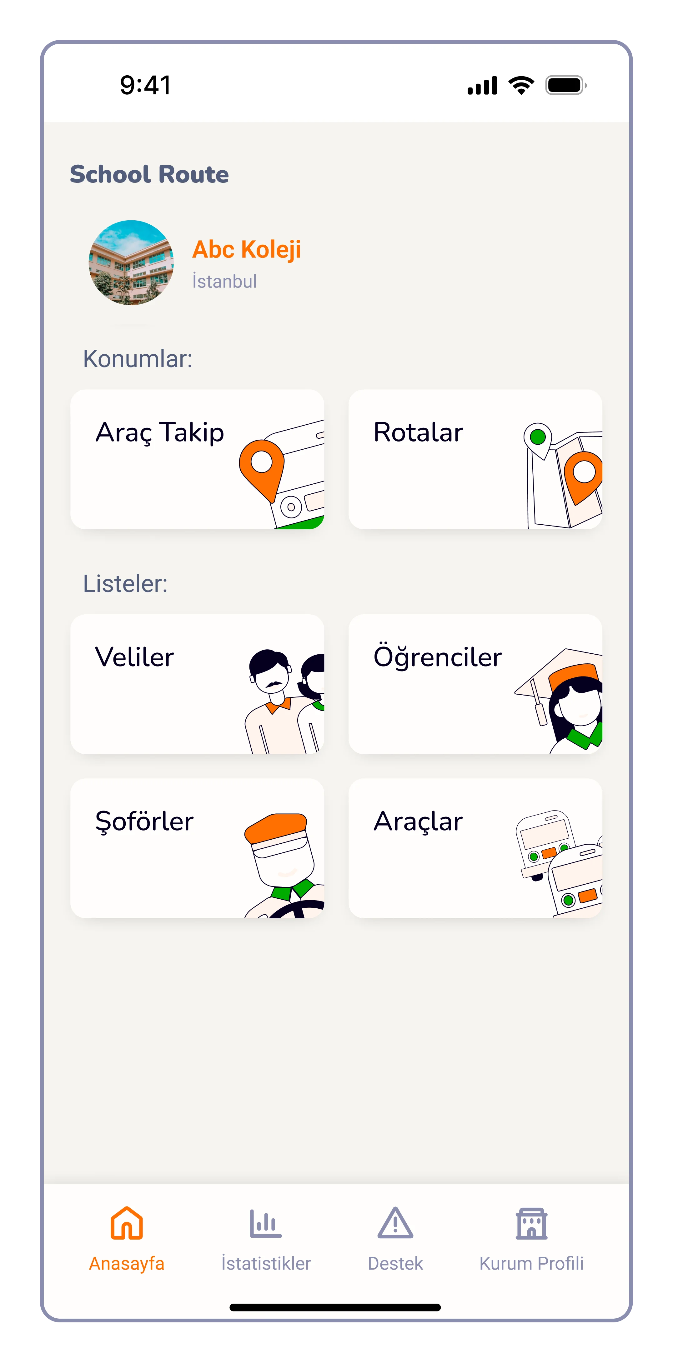
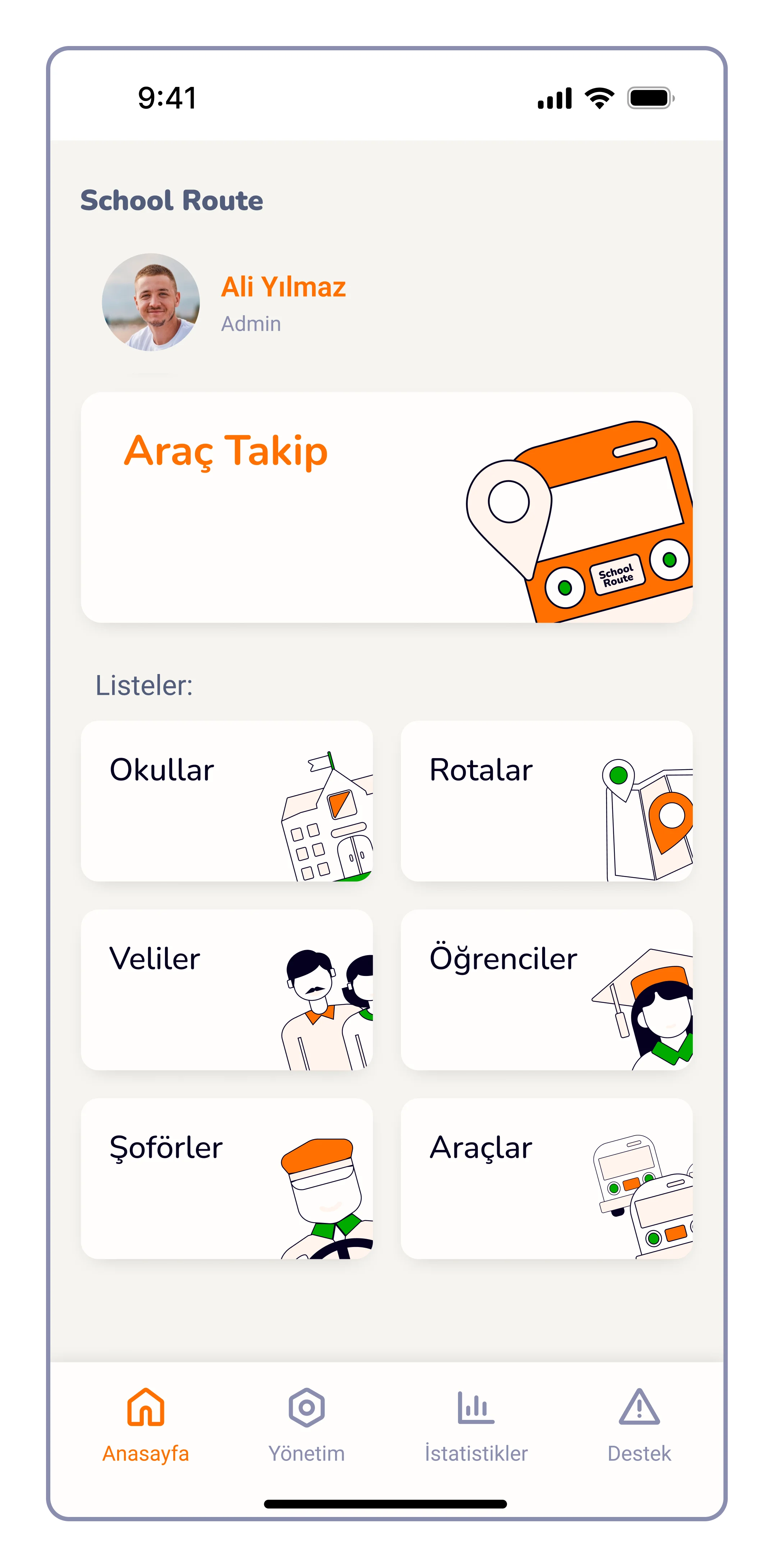
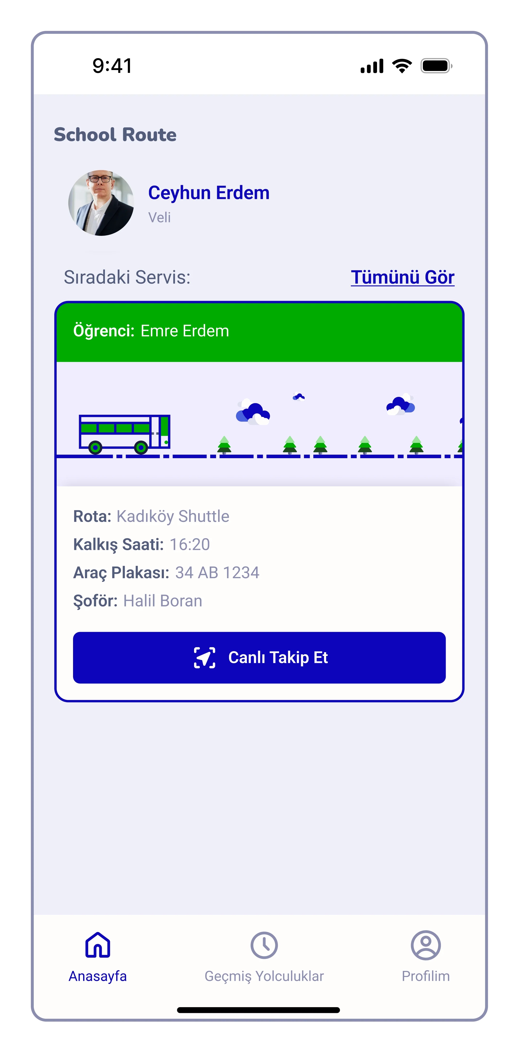
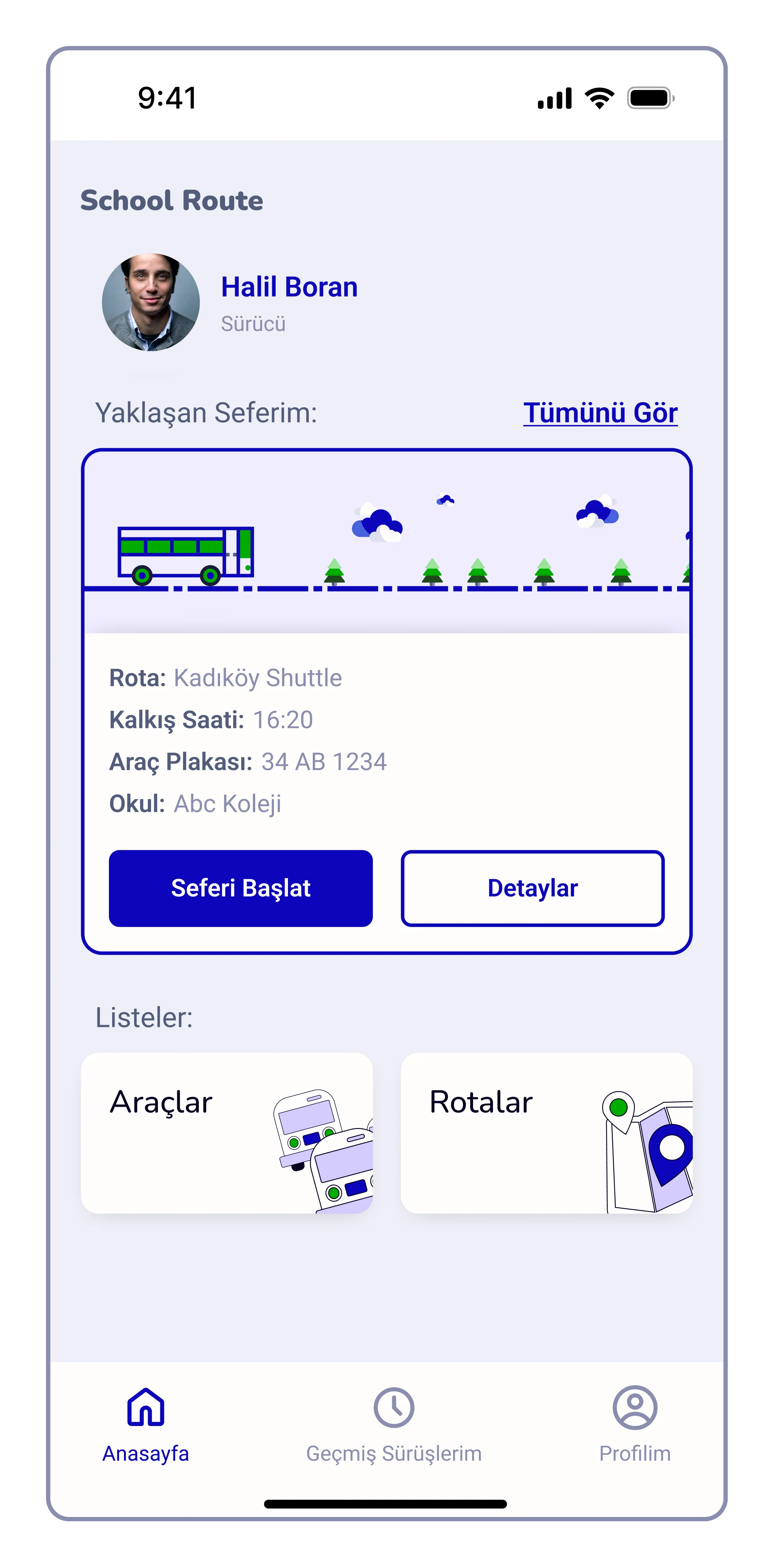
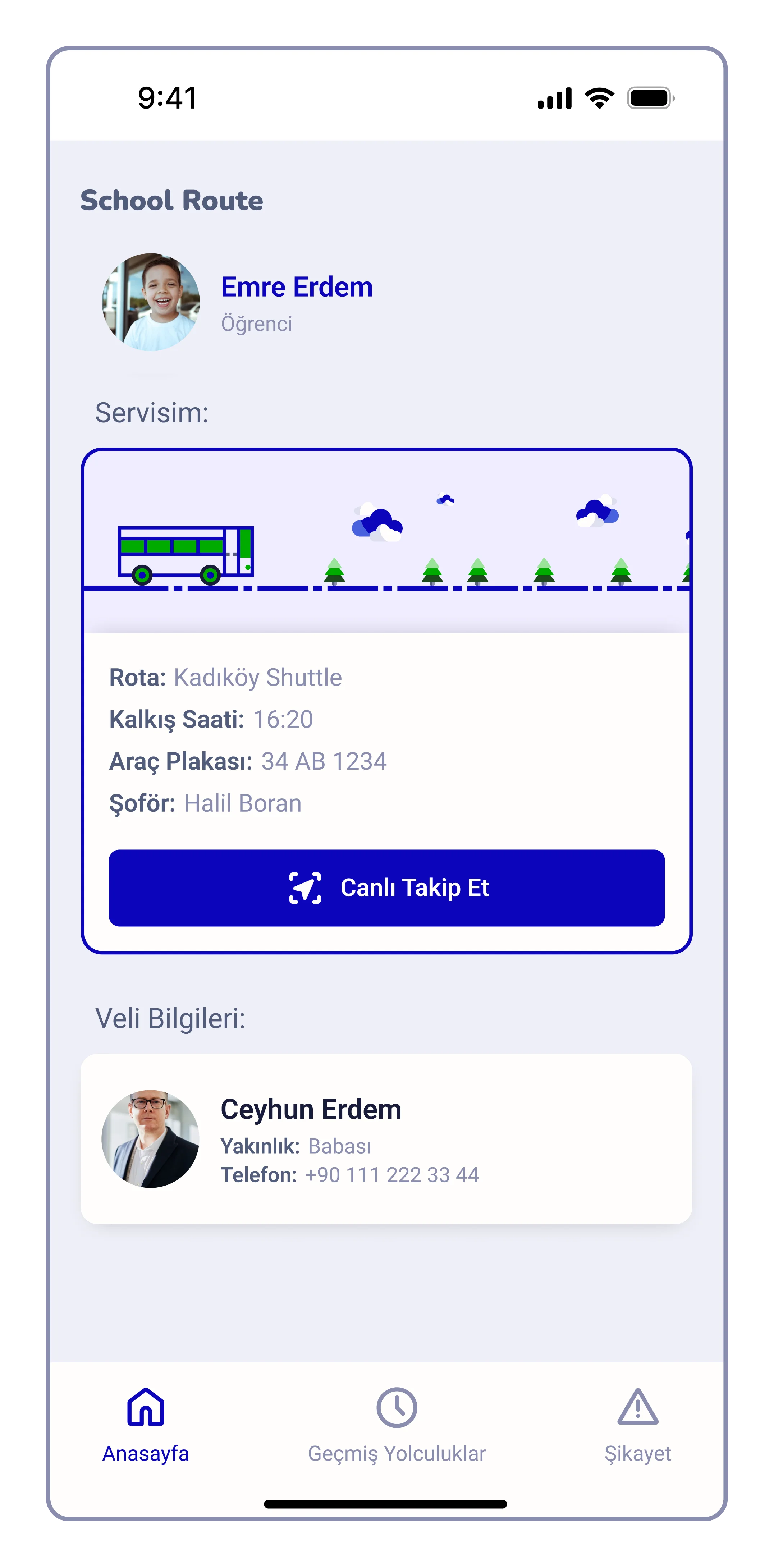
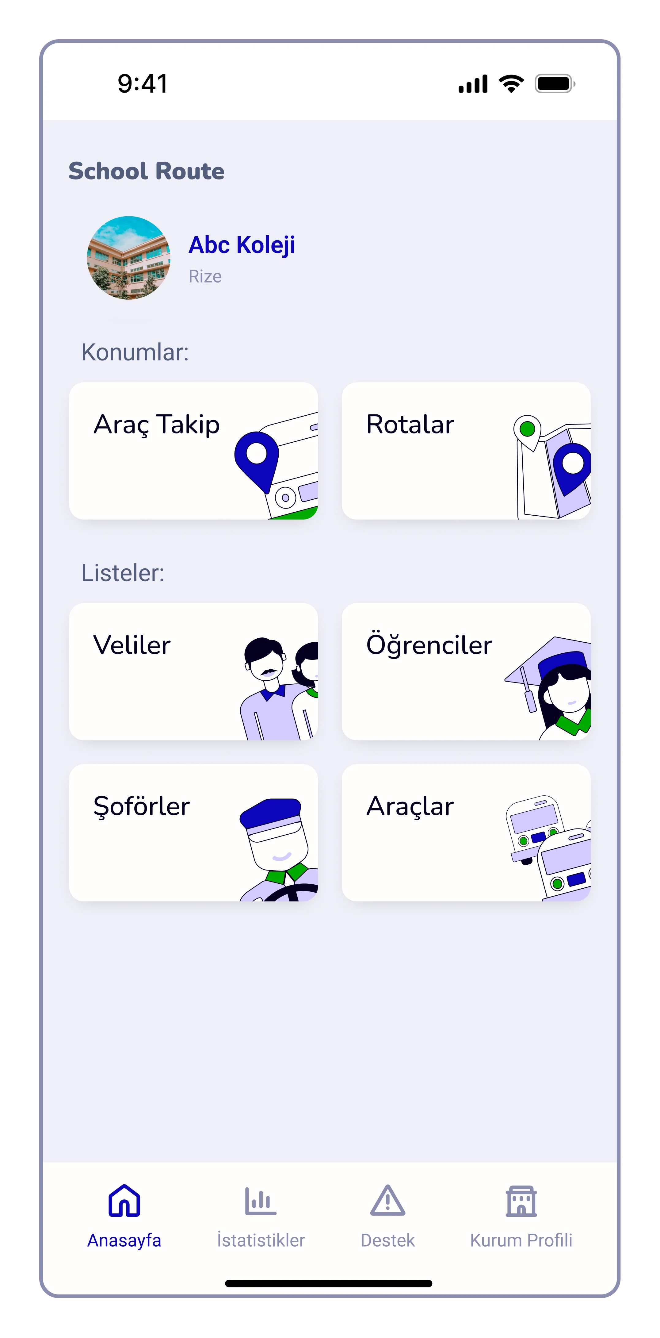
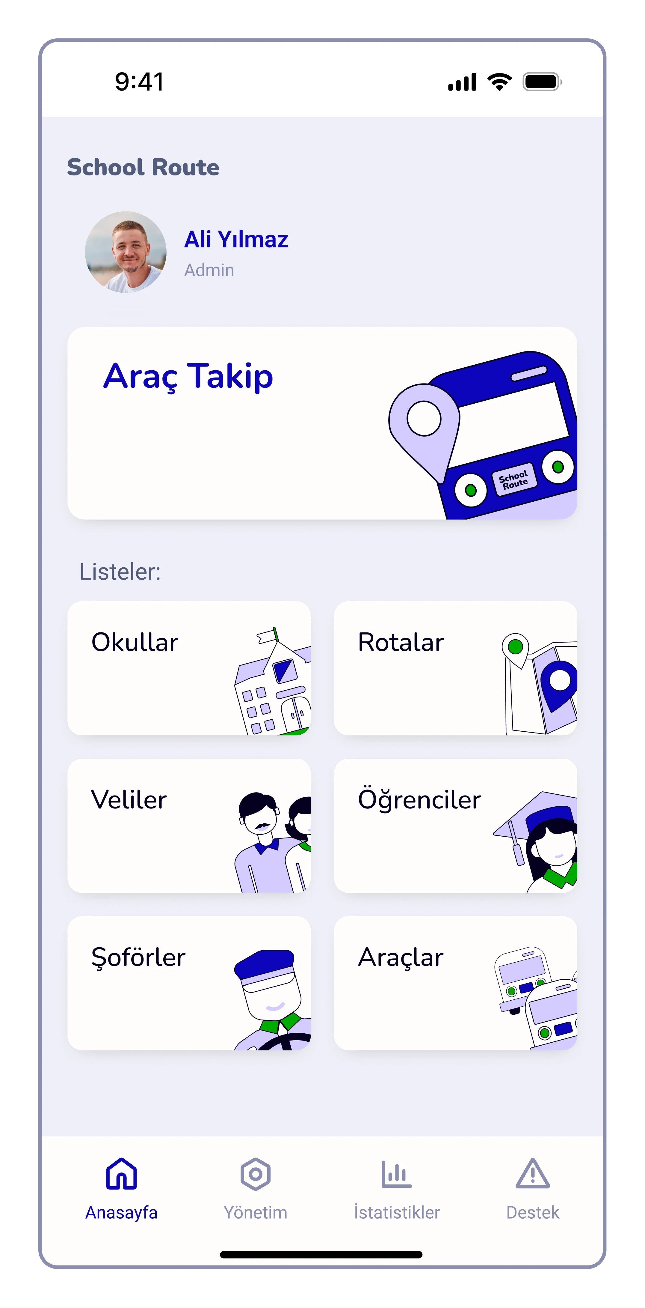
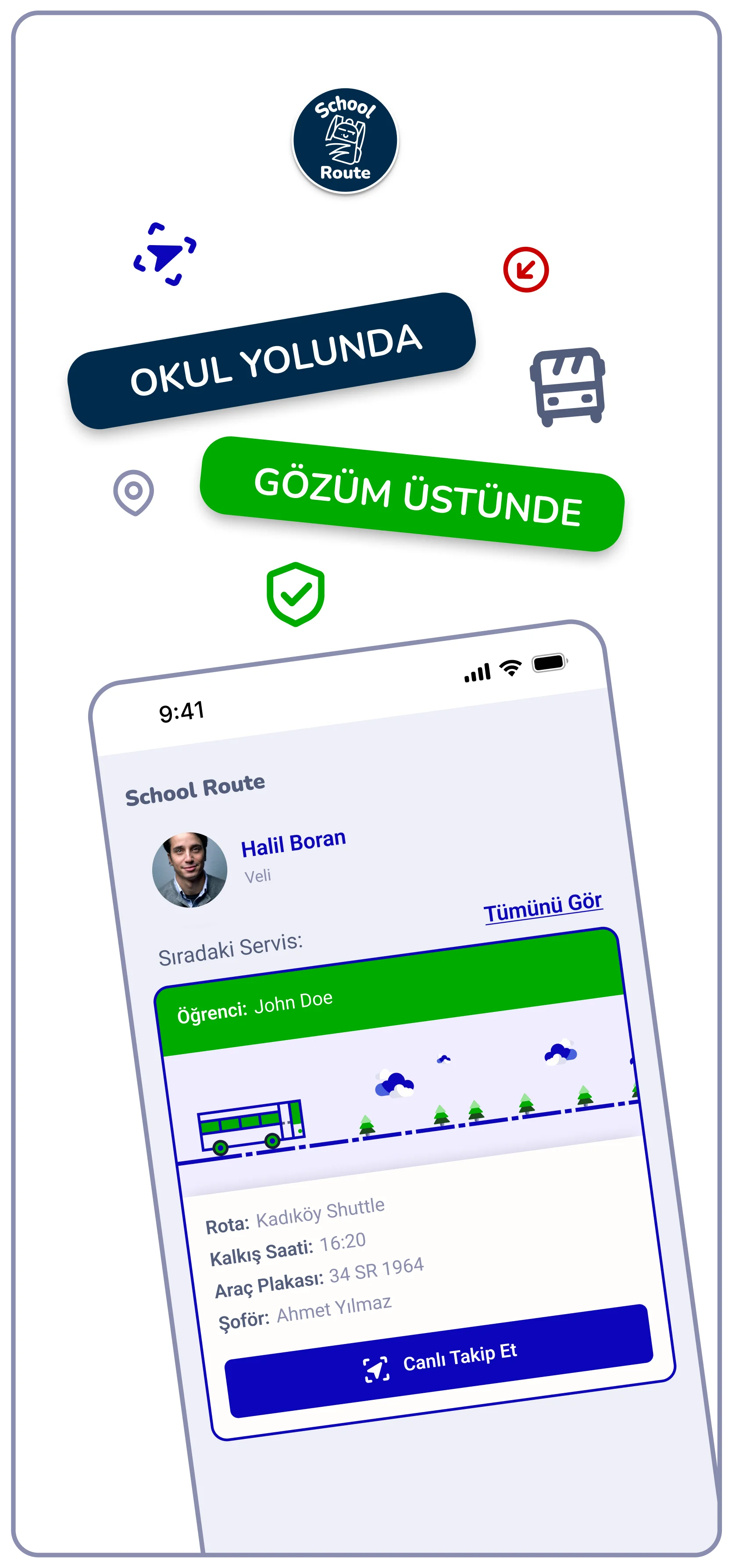
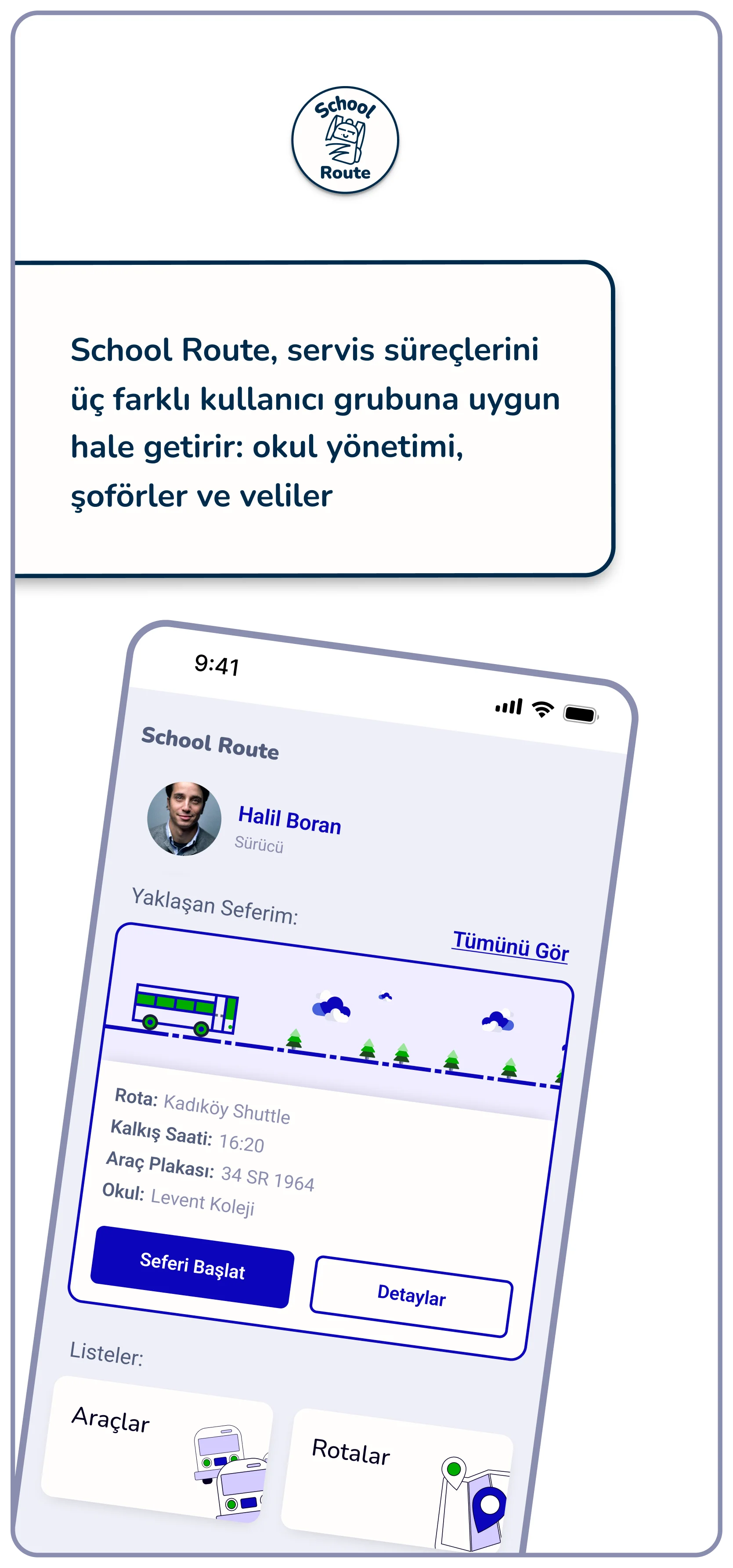
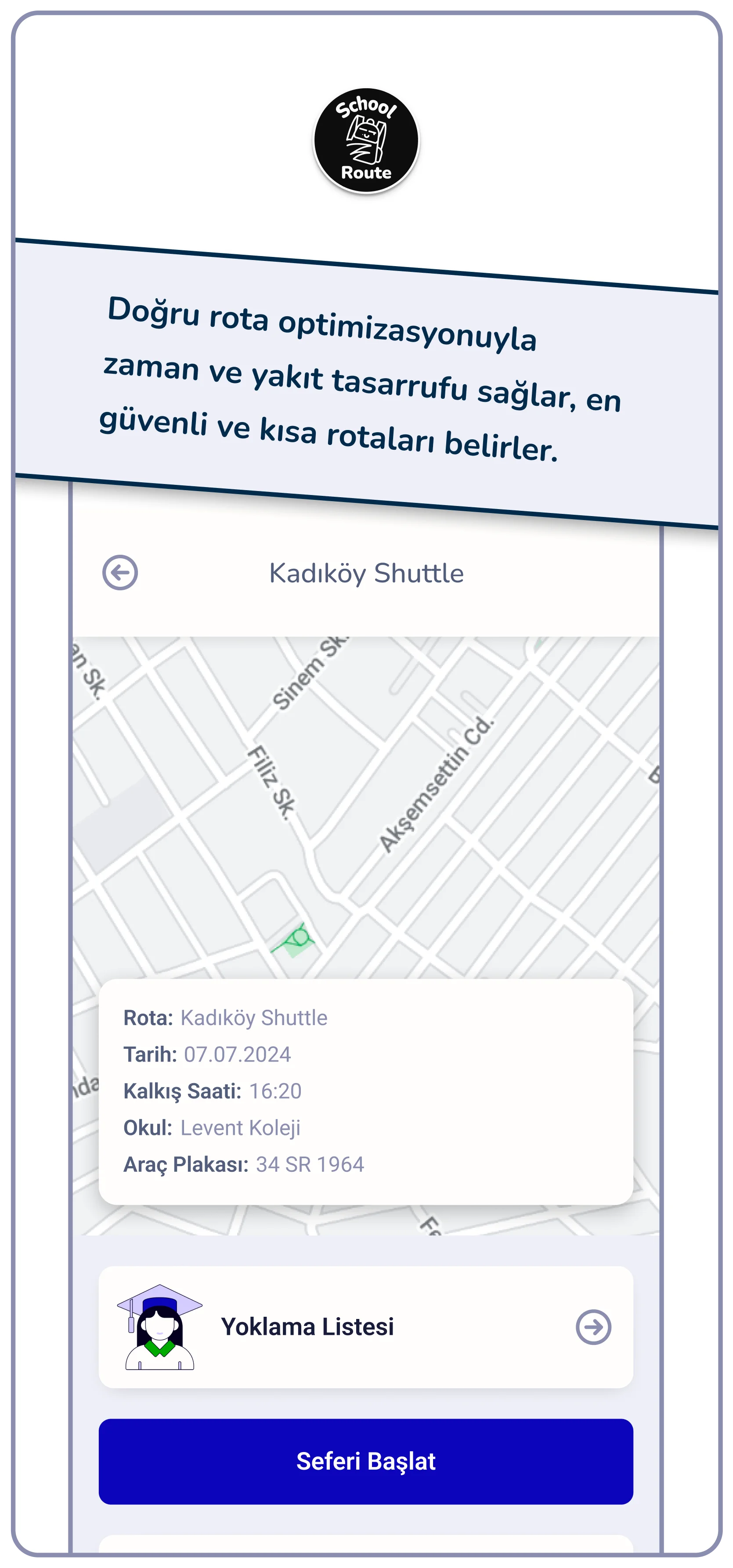
Some of the Final UI's
These are the main screens of different user types of the system. Due to the NDA, complete user flows of all users, web panel UI etc. cannot be showed publicly.
First Steps
Experimenting with the potential features and UI design. Preferred language of the system was Turkish.
Orange Option
In the initial UI drafts, I chose orange as the primary color to establish an energetic and approachable tone for the product. This choice was intended to create a sense of enthusiasm and warmth for parents and students, ensuring the interface felt welcoming rather than strictly institutional.
Final Blue
In the final UI, I shifted the primary color to Blue to align the primary logo and to be with the trustworthy and professional nature of educational institutions. Aım was to ensure that the interface feels safe and providing a sense of calm and competence throughout the user journey.
Assets
This section presents some of the visual assets of the product such as color palette, font styles, illustrations etc.
Colors
Main color of the product comes from the first Logo idea (which was the Blue #0B05BA). Even though the final logo design had different color palette, client asked specifically for this blue to be the main UI color.
Dark Blue/5
Dark Blue/4
Blue/3/Brand
Light Blue/2
#050020
#181C39
#0B05BA
#4961DD
Light Blue/1
#D4CCFF
White colors were used for various purposes like backgrounds, text colors on blue shades and illustrations.
White/4
White/3
White/1
White/2 (bg)
#F0EDFF
#F9F3FC
#EFEFF7
#FFFEFD
Gray shades were used for text colors to create typographic hierarchy along with illustrations and inactive states of various UI elements.
Gray/3
Gray/2
Gray/1
#DEE0EF
#525D7B
#8B8EAF
Greens were used mostly in illustrations and visual clues of positive actions.
Green/3
Green/2
Green/1
#99E399
#1E491E
#00AA00
Reds were used mostly in errors and warnings.
Red/3
Red/2
Red/1
#E39999
#560001
#CB0000
Fonts
While the Nunito typeface was used for the headings because its soft corners fit the friendly image of the product, Roboto was chosen for the body text to ensure better readability.
When considering all the fonts, it may look like there are too many of them. However, this list of fonts covers the entire typography of the system, not just the mobile app. The system includes a landing page, admin panel, print materials, social media, and presentations.
Illustrations & Icons
This system has various user profiles like schools, parents, and drivers. Each of them has different authorization levels for viewing different data, such as vehicle information and tracking. These illustrations are designed to organize all the data and enhance the overall user experience when dealing with them.
Extras
This section highlights additional visual designs that were part of the process. Rather than being limited to UI, this was a full-scale product design project requiring a variety of creative assets.
404 Screen

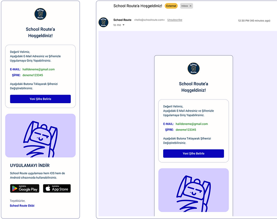
E-Mail Template
Store Images

bottom of page